About Darkroom
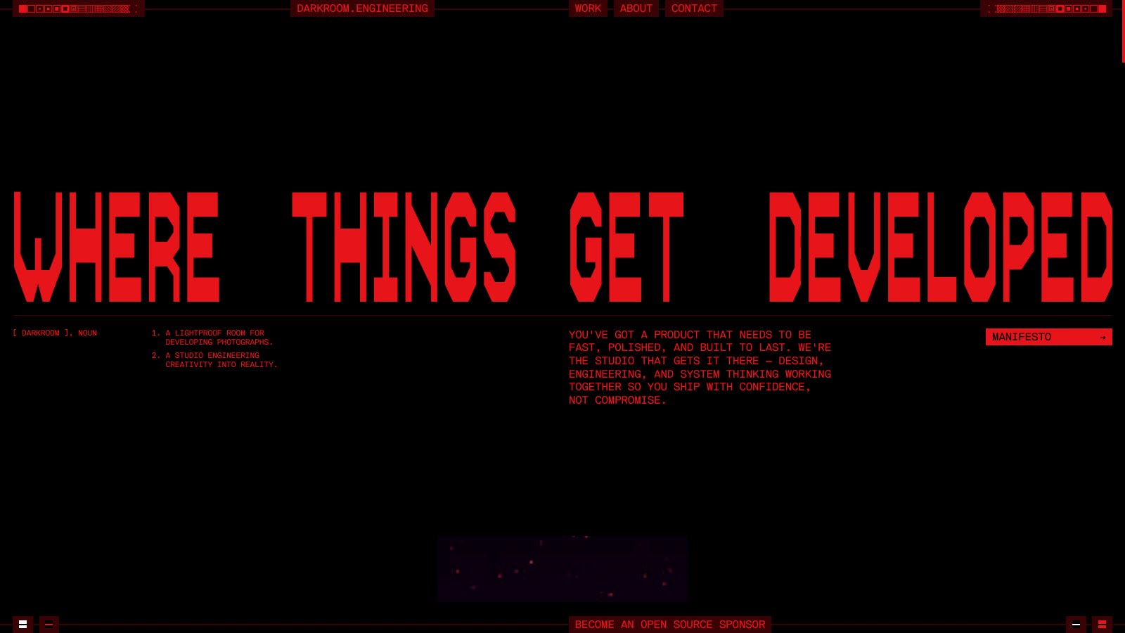
Darkroom is a design and development studio that ships motion-heavy sites, WebGL and headless builds. Its home page is black and red throughout, set in a pixel display face and small mono text, with full-bleed project films that interrupt the page, an activity log that reads like code, and the name breaking apart in a glitch at the bottom.
What to take from it: one colour on black used with discipline, a display face with a strong character for headlines only, and big moving work dropped between dense blocks of text.
What makes it work
- 01
A pixel headline in red
The first screen is one line of pixel type across the full width, with tiny mono notes around it. It feels like a boot screen, which suits a studio that sells code.
- 02
Project films that cut in
Full-bleed footage of client work breaks into the red page and leaves just as fast. The hard cuts make the portfolio feel like a trailer.
- 03
A name that breaks apart
At the bottom the studio name is set huge and torn by horizontal glitch lines. The footer becomes the last piece of motion instead of a list of links.