Scroll0%
Checker Features preview

Features
Free
Checker Features
Open this page on a computer to tune the effect. You can still copy it with the default settings.
About Checker Features
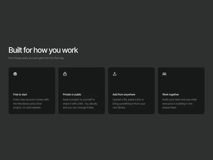
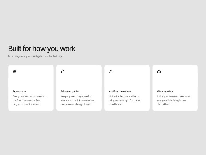
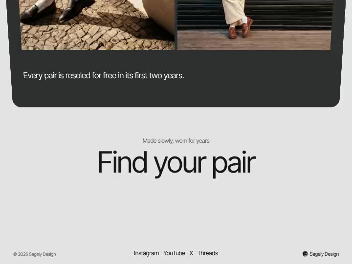
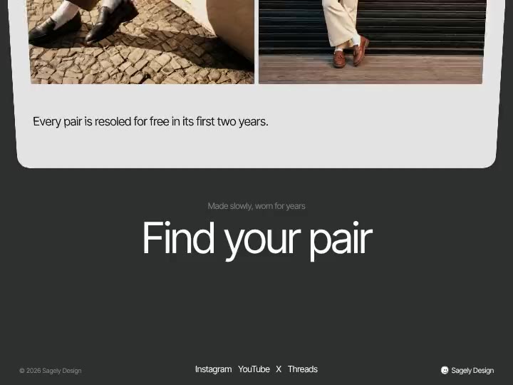
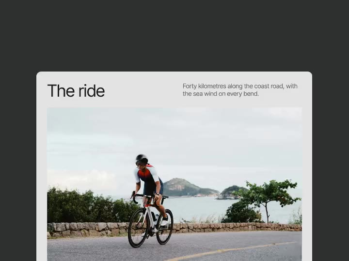
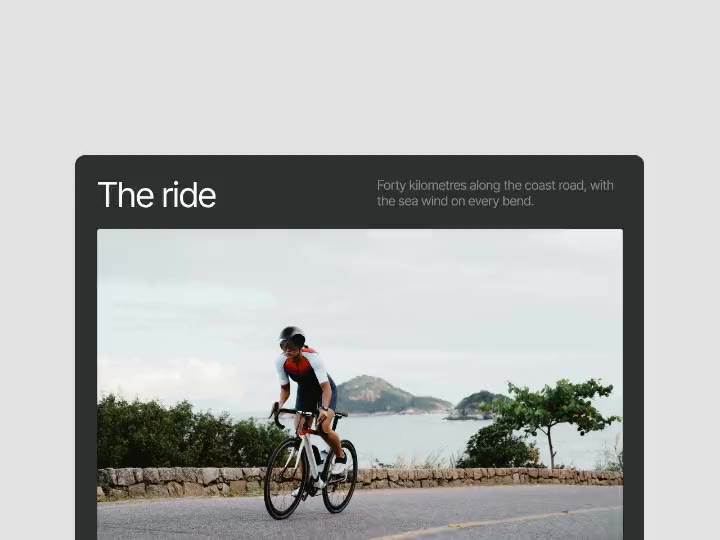
A features section on a four-column grid, the cards in a checkerboard after the heading. Each card is half a gradient panel with a moving line drawing and half a light block with a bold title and text; the cards rise into place one after another as the section scrolls in.
What you can tune
- Heading: Heading
- Cards: Cards, Corners, Title, Text
- Call to action: Show, Title
- Colours: Page, Heading, Card, Card text, Panel, Drawings
Where it works
SaaS and product landing pages that list what a product does, with a call to action at the end. Six cards with small moving drawings carry the features, and the grid steps down to two columns on a tablet and one on a phone.
How to use it
- Tune it live on this page.
- Copy it for Figma, Framer or Webflow, or copy a prompt for Lovable, v0, Bolt, Cursor, Claude Code or Codex.
- Paste it. Your settings come with it.
Checker Features is free with a Sagely account.